Seven Cover Mistakes That Are Silently Draining Your Royalties
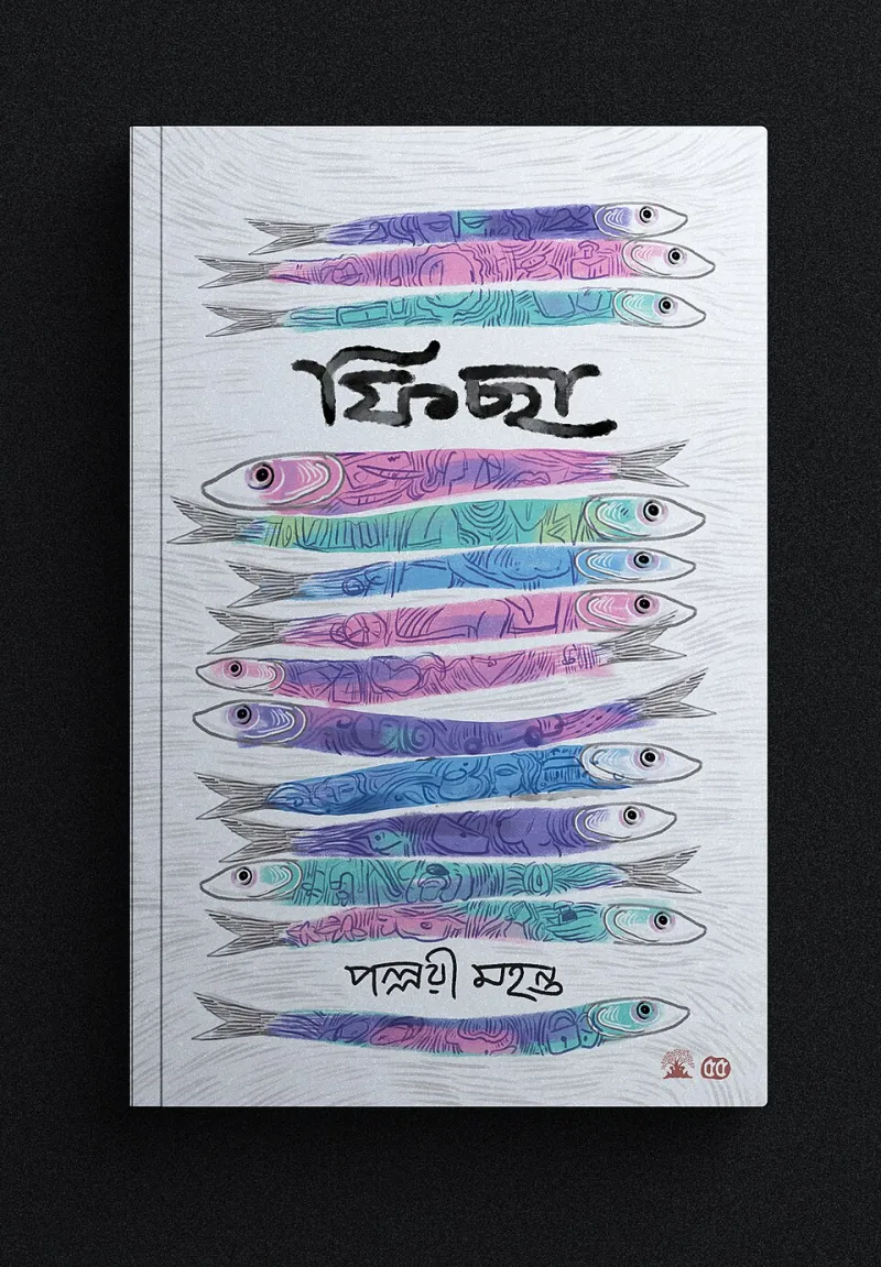
Photo: Sanjib Borah (Artist), CC BY 4.0, via Wikimedia Commons
Let's get one thing straight: most indie covers don't fail because the art is bad. They fail because the art is saying the wrong thing to the right reader. A cover is a salesperson working a crowded floor, and if it's not making the pitch in three seconds, it's costing you money.
Here are the seven mistakes I see over and over—and what to do instead.
1. Your Cover Is Signaling the Wrong Genre
Readers shop by genre, and they judge genre in under a second. A literary-looking watercolor on a thriller tells thriller readers this isn't for them. A photographic cover on an epic fantasy reads self-published before anyone reads your name.
The fix: Pull up the top 20 bestsellers in your category and study what they share. Color palette, typography, imagery style. You don't want to copy—you want to belong. Familiarity sells. Your originality shows up in the story, not the cover template.
2. The Thumbnail Test Failure
Roughly 80% of your potential buyers first see your cover as a stamp-sized image on a phone. If your title is unreadable at thumbnail size, you've lost the sale before the page even loaded.
The fix: Shrink your cover to 100 pixels wide and look at it on your phone. Can you read the title? Does the composition still land? If not, increase font size, simplify the background, and cut any detail that turns to mush at small sizes.
3. Designing for Yourself Instead of Your Reader
Your favorite color, your cat, that quote your grandmother loved—none of it belongs on your cover unless your target reader wants it there. The cover isn't your self-expression. It's packaging for a product someone else is buying.
The fix: Write a one-sentence reader profile—"women 35–55 who binge small-town romance on their commute"—and evaluate every design choice against it. Not you. Her.
4. Ignoring Comparable Bestsellers Entirely
Some authors refuse to look at other covers because they want to "stand out." Standing out is good. Standing out within a recognizable genre language is what sells. There's a reason thriller covers look like thrillers and cozy mysteries look like cozy mysteries.
The fix: Build a quick mood board of five comp titles from the last two years—not decade-old classics, current books. Hand it to your designer or use it to guide your DIY work.
5. Typography Crimes
Two fonts maximum. Title readable first, author name second. No Papyrus. No letters crammed edge to edge. Bad typography is the fastest way to look amateur regardless of how good your imagery is.
The fix: If you know nothing about type, use a proven font from a paid library, give the title generous breathing room, and check the hierarchy: does your eye hit the title first, every time?
6. DIYing Past the Point of Diminishing Returns
Canva is a great tool. It is not a great tool for a genre where covers are hyper-competitive and readers have trained eyes. Knowing when to stop DIY-ing is a budgeting skill, not a creative failure.
The fix: If you're writing in a visual, saturated genre—romance, thriller, fantasy—budget $300–800 for a professional cover and treat it as marketing spend, not decoration. For lead magnets, low-content books, or niche nonfiction where competition is thin, a well-executed template is genuinely fine. Match your spend to your market.
7. No Print Spine or Back Cover Thinking
If you publish in print—and you should—your cover isn't just a front. A weak spine means your book disappears on a shelf or at a signing table. A cluttered back cover wastes your best blurb real estate.
The fix: Design the full wrap: bold spine typography readable from six feet away, and a back cover with one hook line, a short blurb, and room to breathe. Order a physical proof and judge it in your hands, not on screen.
The Payoff
A strategic cover is one of the few investments in publishing with a direct, measurable line to sales. Fix these seven mistakes and you're not just making a prettier book—you're hiring a better salesperson. And unlike your marketing, this one works 24/7, forever, for a one-time fee.